Recently I've been doing a lot of lived user accessibility testing, which involves observing people with disabilities using assistive technology to perform specific tasks on websites or apps. The goal is to identify the issues they encounter so the site owner can remedy them.
One issue I've frequently observed, which was totally unexpected for me, is uncertainty and confusion on the part of blind users about form submit buttons. I've repeatedly seen them navigate past the button, often several times, and ask me if this thing really is the submit button before eventually deciding to try it.
The reason for the uncertainty is unclear and/or non-standard wording on the submit button.
Some examples from my recent testing that confused blind users:
- A submit button for a contact form whose label read "Send"
- A submit button for a newsletter subscription form whose label read "Subscribe"
- Submit buttons on different steps of a multi-step form which read "Order now" and "Add to order"
What do all of these have in common? Non-standard label wording. The typical wording for a form submit button is, well, "submit".
You'd think those labels would be perfectly understandable. And for sighted users, they usually are. But it's totally different for blind users.
Why is that? Let's think about it from a blind person's perspective.
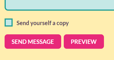
Typically, a form submit button is visually styled to stand out and look like a button. It usually is fairly large and rectangular with a distinctive background colour. It is placed on a separate line at the end of the form, often on its own, and has a fair bit of whitespace around it.
For example, the submit buttons on this site's contact form:

You could probably change the submit button wording to "Zorg" and many sighted users wouldn't even notice. They would just hit that button-looking thingy and get on with it.
But a blind user has none of these visual style cues to go on. They only hear something like "Send, button". The non-standard wording creates confusion about whether this is really the "submit" button since it doesn't say submit? What will it do if they activate it?
Like it or not, users are accustomed to the "submit" wording (in English, of course). Designers love to customize wording on things like buttons so they're not standard and boring. But the problem is, standards are what users expect, and violating them can significantly degrade their experience. Thus it should either be avoided, or accompanied with thorough testing to make sure what you're doing is understandable to all users.
Note this could vary in different situations, for example in the case of a multi-step form, the "next" button is usually actually a submit button; but given that from the user's perspective, it navigates them to the next step, "next" or "continue" might be better wording, until the last step which finally submits the entire form, where "submit" would be appropriate.
Bottom line: the most usable wording of a form submit button for blind users is usually "Submit". Think twice about changing it to something else, and if possible, test with blind users to see if they understand it.
Note that this is in English, of course! I'm sure there is equivalent standard wording for submit buttons in other languages, and the same principle would apply.
Looks like I'll need to change my own site's contact form submit button based on this finding.